DatePlay
As an intern turned part-time designer, I led the design and implementation of the second iteration of DatePlay’s dating app.
PROBLEM SCOPE
The Dateplay app in the app store had a low user retention rate despite the high number of downloads.
The company had an established user base, but unfortunately, the app was not engaging enough to keep people interested. I was responsible for understanding what problems users were currently experiencing and what type of experience they desired in order to completely redesign the DatePlay app.
VISION & BRANDING
DatePlay lacked a strong brand identity or product vision, which affected their app design.
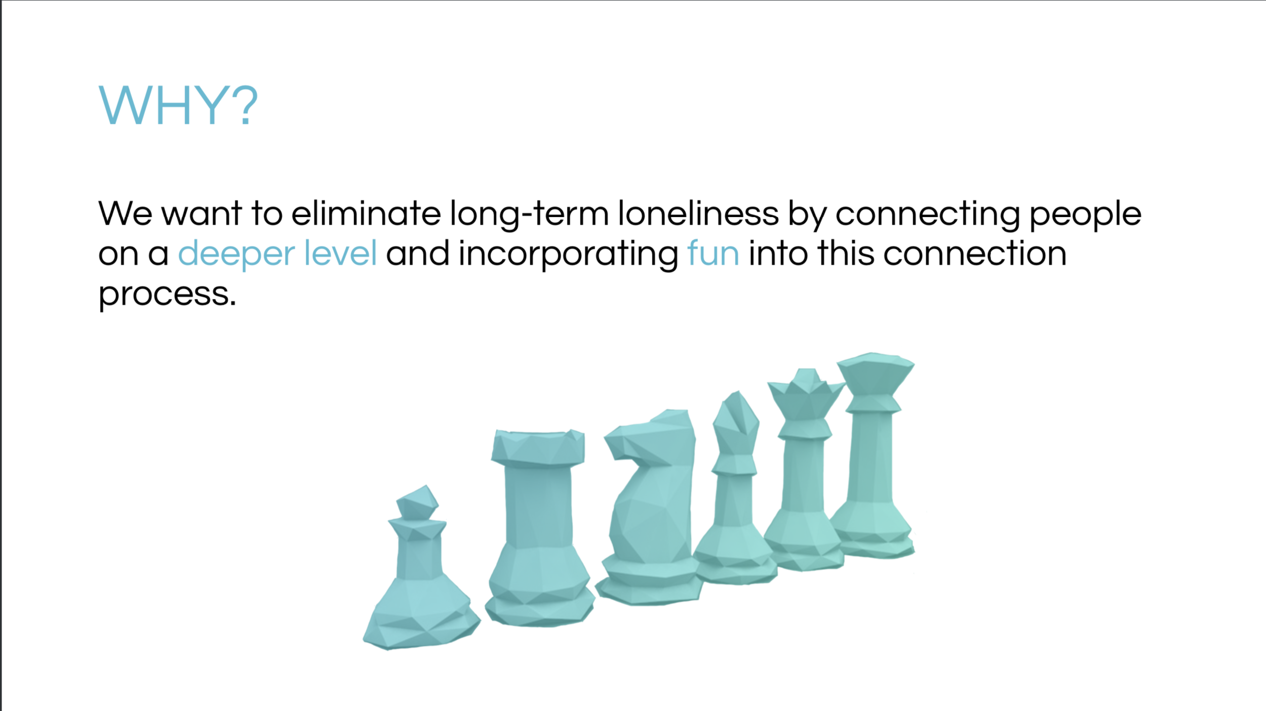
Speaking to the CEO revealed to me that she really cared about encouraging people to establish genuine connection. Unfortunately, this was not thoroughly emphasized in their brand. I helped the company define what they were trying to accomplish and why. Specifying this focus facilitated the direction of the design process.
RESEARCH & MARKET ANALYSIS
Users were interested in playing games to connect but didn’t stay long enough to meet anyone.
I needed to identify UX problems in the current app to effectively redesign it and improve user retention. I researched information on games and dating to inform my design decisions.
USER TESTING & DESIGN SOLUTIONS
User feedback suggested that the old app failed to encourage meaningful connections due to limited game options and sparse matches.
FEATURE REQUIREMENTS
With the design problems in mind, I explicitly defined all the features of the app redesign based on the newly established brand identity.
I defined all features of the next app iteration and provided this extensive list to potential developers. The new features expanded upon the main idea of the original app and improved interaction potential for matches.
UX ARCHITECTURE
The new app flow focused on connecting people seamlessly through a good algorithm and fun games.
I came up with a new structure for connecting matches and wrote out the algorithmic steps for the development process. I outlined the flow of the app for the CEO and other stakeholders to visualize how the app was going to work.
VISUAL DESIGN
Regarding visual design, the old version of the app had a juvenile appearance and didn’t match our target audience.
I chose a new aesthetic, style, and overall look. Since this is a gaming app, I based it off of the low-polygon art style, which is frequently associated with games.
FINAL PROTOTOYPE


